Problem Statement
How might I...
...create a musical discovery app that encourages children to pursue independent piano/drum lessons?
Project Context & Ideation
Ribbit Tunes is the my final project idea for Tufts' ENP64: Methods for Human Factors. This project entails a physical product design and matching mobile app that is honed to solve a problem of my choice. To choose a theme for my project, I decided
to do something music-related, since it is something that I am very passionate about. I researched problems and found that children are often sensitive to loud sounds, which can also impair cognitive development.
Naturally, I wanted to design a music-based product that allows users/children to express their creativity. I began by designing the physical product, with a few sketches.
I also created a persona to represent a user group for this product. Meet Curious Connor!
Design Process
Ideation
There's a lot to tackle: both a physical product and a matching user interface. This is when I decided which direction to go for each one.
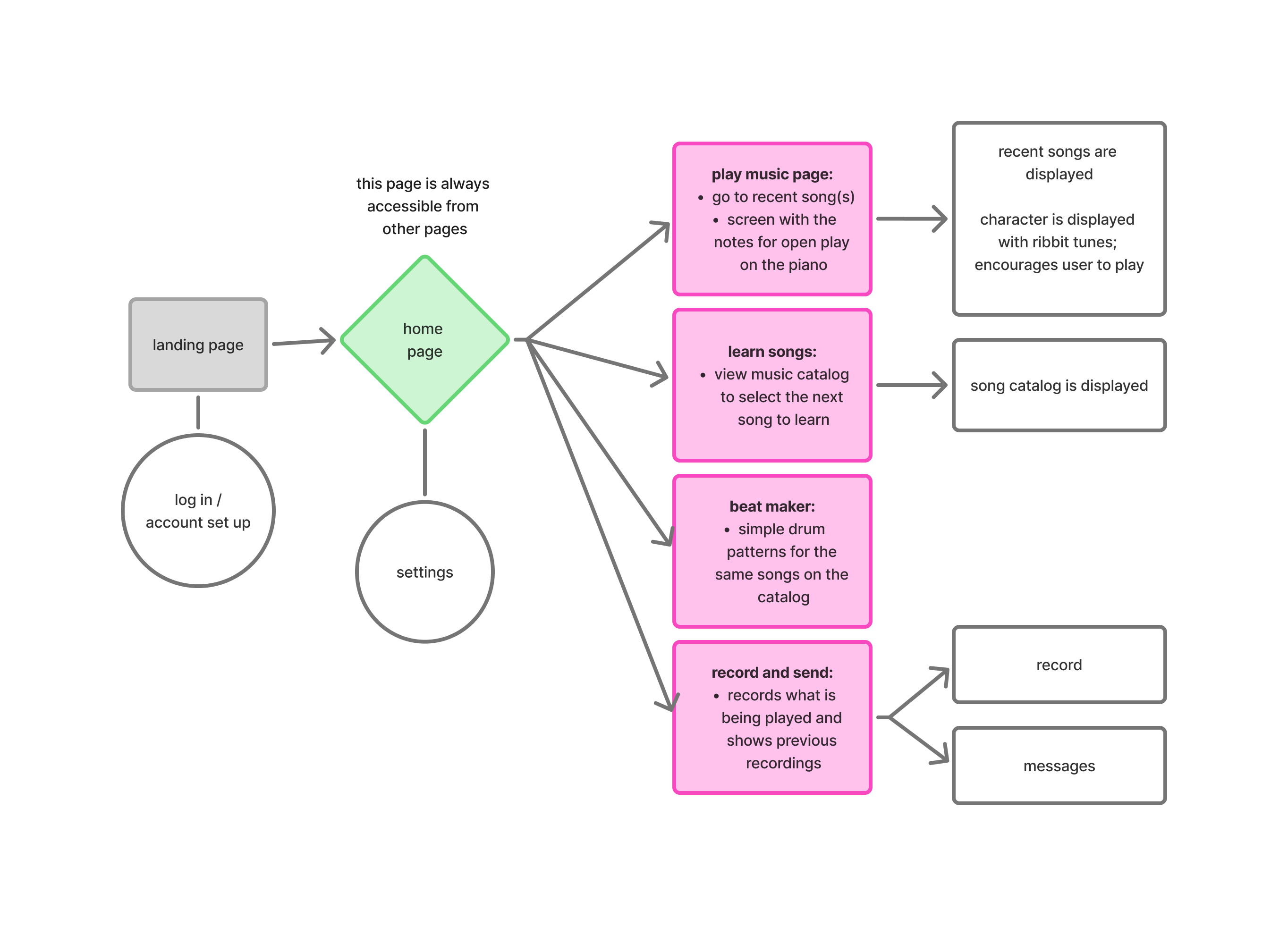
User Flow
Moving into the UI space, I thought about a simple path that children could follow as they use the app. (Of course, they should be able to read.)
Wireframing
During this step, I chose my branding and developed simple wireframes to improve off of.
Hi-Fi Frames
Conducting a heuristic evaluation on myself, I made high-fidelity screens to improve the users' experience.
Prototyping
After designing, I pieced everything together in a simple prototype.
User Testing
To test the usability of my design, I conducted user testing to find the strengths and weaknesses of my design.
User Flow
Children often use (their parents') phones to play games or have something to keep themselves busy with. For my interface, I wanted to include a simple navigation that is easy to follow and also familiar to child users.
Branding & Wireframing
I am happy that I chose children to be the target users for this product, as I was able to play around with fun design choices. Having made my vector frog to initiliaze the design direction for the project, I also chose out supporting colors and fonts that I wanted to use in my design.
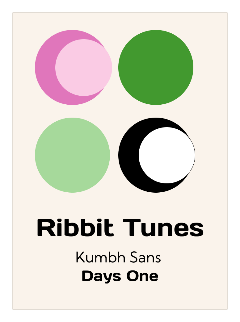
I chose an easy-to-read font as the main sans-serif font. The colors are also bright and colorful, without being excessively neon to cause strain in children's eyes. The Days One font was chosen to make the branding for Ribbit Tunes more fun and easy to recognize.
I needed to create some sketches to visualize the space that I was designing. I did just that and made simple wireframes to try and see what they would like would with the branding applied.
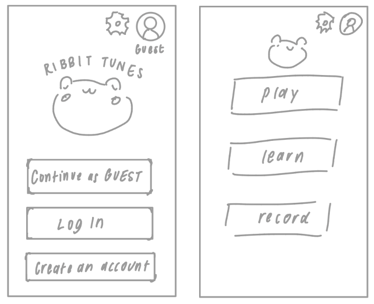
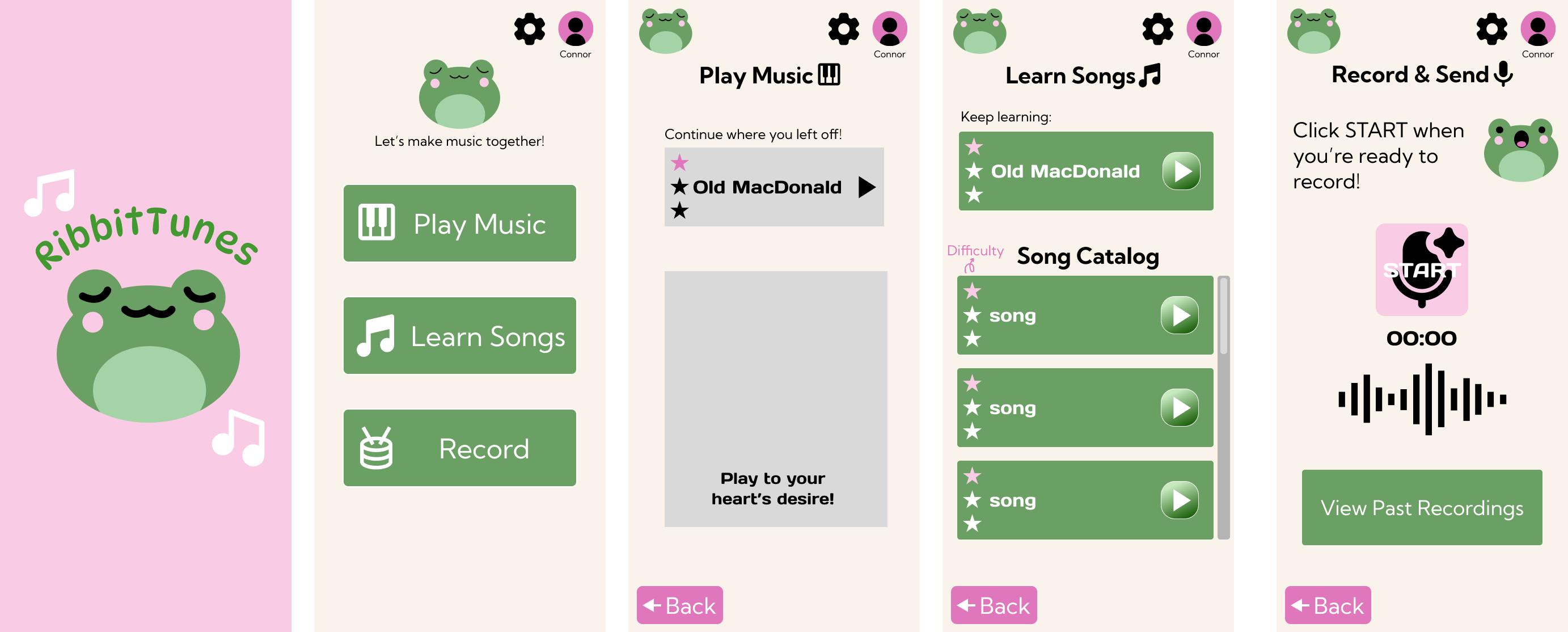
There are 4 main functions I wanted the app to have:
Free Play
Where users can play whatever they like and play the song they're currently learning in the background to follow along.
Learn Songs
Teaching users how to play different songs in the catalog in simple, familiar manners such as music blocks like in the apps Piano Tiles and Kids Piano, or clef reading like in Simply Piano.
Making Beats
Using the physical product, users can learn to play different rhythms along to songs or whatever their heart desires.
Record & Share
Users can record themselves playing and share it to trusted contacts who also have the Ribbit Tunes app (no, I did not prepare the parents' version yet!).
With these steps in mind, I developed two mid-fidelity frames that better grasped the goals I was going towards:
One major improvement I made was making the buttons look more like clickable buttons. In the previous wireframes, it may not have been too clear that they are elements that a user can interact with.
Now that I had a better sense of direction, I fine tuned and made improvements upon my initial low/mid-fi wireframes.
I chose different colors for different buttons or sections to demonstrate that they are different tasks and for users to be able to remember and distinguish the buttons/tasks by these colors. For all of the high-fidelity screens, I made sure to include the task color into each page's design. This would help the user memorize the differences in tasks/buttons. Although the theme is cohesive, this slight difference is effective in differentiating where each home page button leads to.
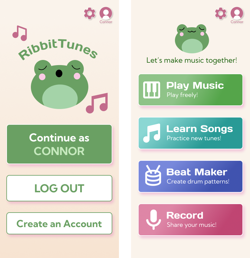
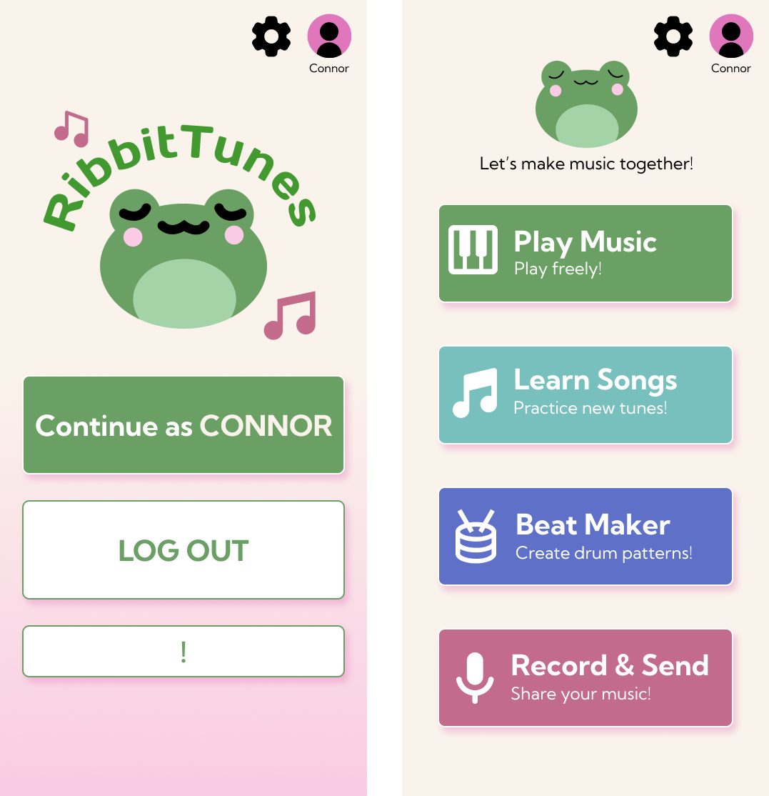
Welcome & Home Page
Here you can see how I developed the previous two frames I showed. I made the background less bright for a softer, more welcoming experience. I also integrated the brand fonts that read the main button features. They also have small descriptions so users won't be surprised when they click into those pages. The reason that I only added text under the user image at the top right was to highlight identity and independence of the child learner. I didn't add text for 'Settings', since it's not a button I expect the child to be tampering with or editing as much as a parent or guardian would.
- Introduction of Ribbit Tunes mascot/character
- Minimal and intuitive home page with descriptive buttons
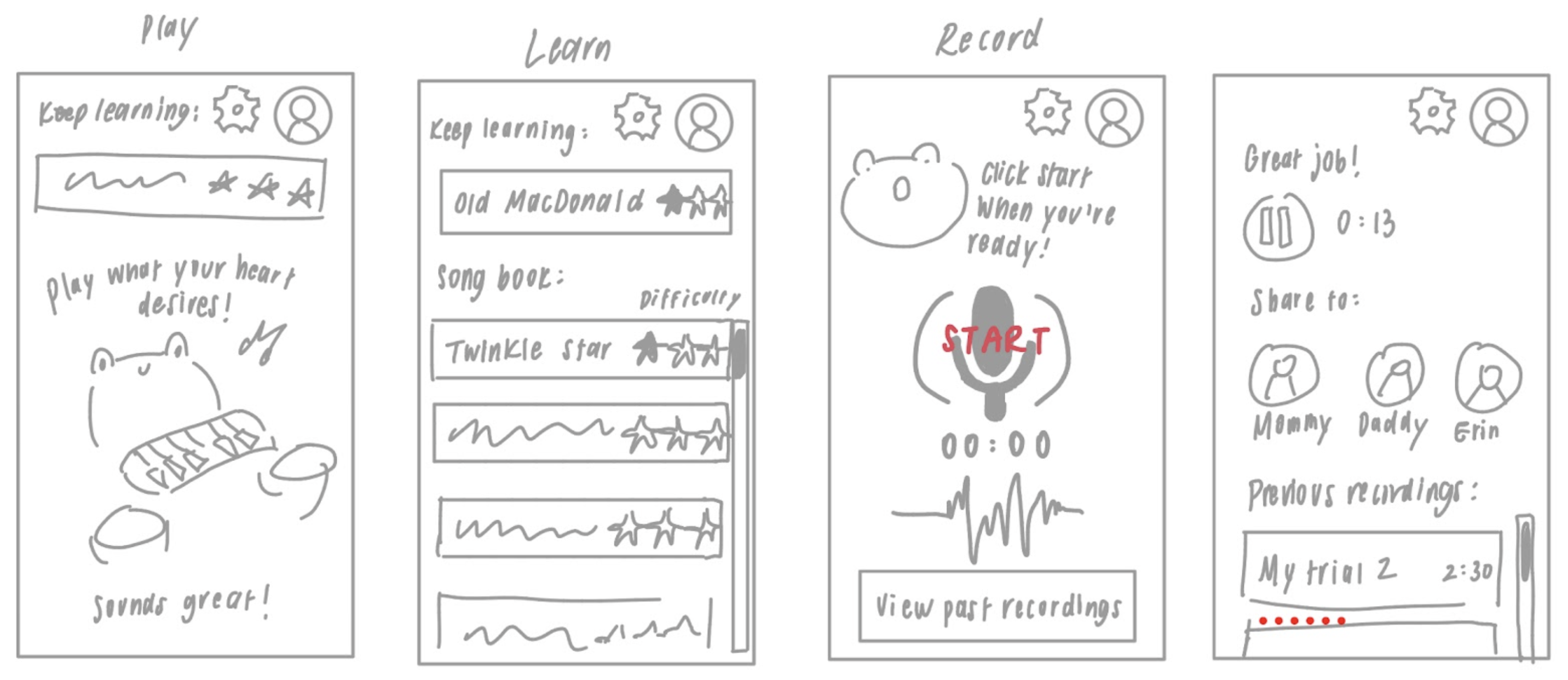
Free Play
When users want to play freely without restraint, this is the page that they would click into. The song that they are currently learning will appear, and the user can play it in order to follow along independently. An animated frog will move along to the tune that the user is playing, saying encouraging things on the screen.
- Connected elements to other main features (song lessons)
- Cute and simple design to encourage independent practice
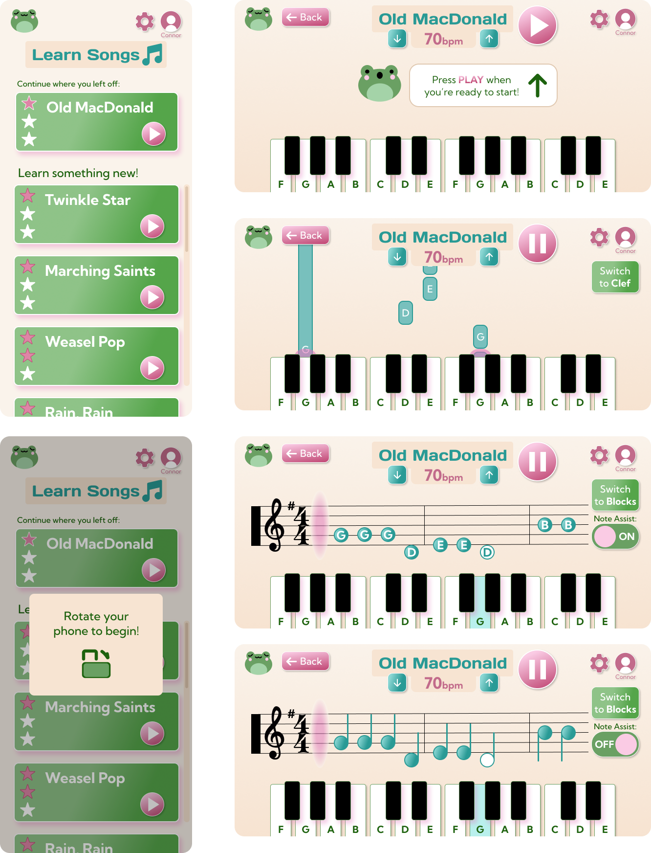
Learn
In this page, users will be able to access the app’s catalog of song lessons. The difficulty is shown using stars, and a play button appears on every song if the user wants to hear a sample of it.
I used a scrollable list because it’s common and familiar. This means the users will have experience using this. I made sure to add a scroll bar to show the user where they are in the list.
A pop-up will remain on the screen without having users confused about what to do. A darker background was chosen to help the pop-up stand out.
An instruction note was placed in the middle of the interface with direction for what to select next to minimize confusion.
The buttons are displayed on the right to not interfere with the notes. The keyboard display changes color when that note is being played. To emphasize this, a pink glow appears.
In clef mode, the pink glow that demonstrates when notes are played are on the left side of the clef. The keys still change colors when a note is being played to maintain consistency.
If ‘Note Assist’ is turned off, the tail of each note will appear to make it more realistic to how normal music is being read. The on and off bar has text indication to ensure the mode that is employed is communicated.
- Intuitive scrolling for song catalog
- Different modes of learning to accomodate to learners of different levels
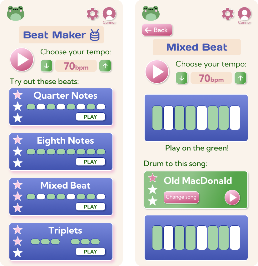
Beat Maker
On this page, users are able to play beats at a tempo of their choice to learn how different beats sound. Users can click into a beat option and play it when that beat lights up. They can also play that beat to the song they are learning (with the ability to change the song as well).
- Cohesive design elements
- Intuitive rhythm learning patterns
Record & Share
In the record page, users are able to record themselves playing, access their previous recordings, and share their recordings with trusted contacts. I kept icons and formatting similar to well-known and familiar recording apps such as Apple's Voice Memos.
- Familiar ways of creating voice recordings
- Secure and simple way to share recordings to loved ones
Prototyping
This is the prototype of the interface that I used for user testing.
User Testing
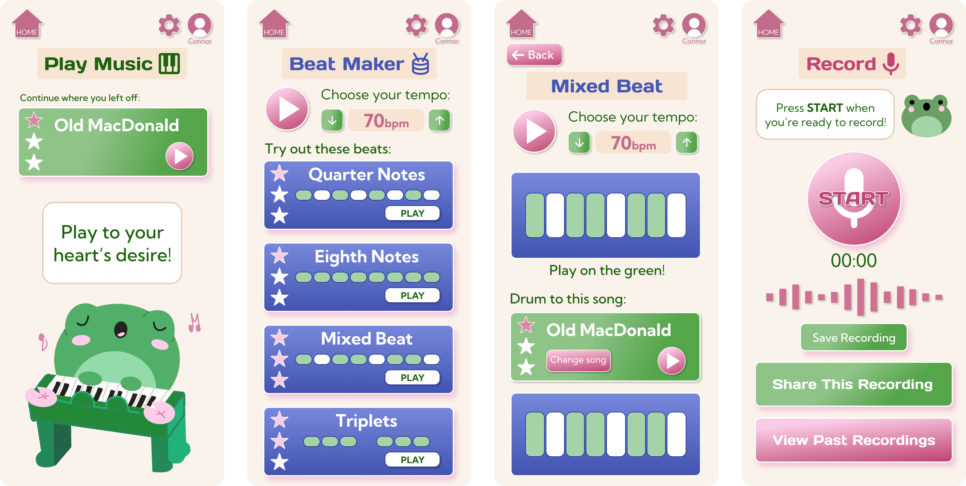
To test the usability of the app, I wanted to hit all three usability testing metrics:
- Behavioral metrics capture quantitative data like clicks and time on page
- Attitudinal metrics focus on how users feel, as measured by satisfaction ratings or feedback surveys
- Operational metrics that focus on efficiency and accuracy rates, such as task success and error rate
To achieve this, I prepared the following tasks for a usability test:
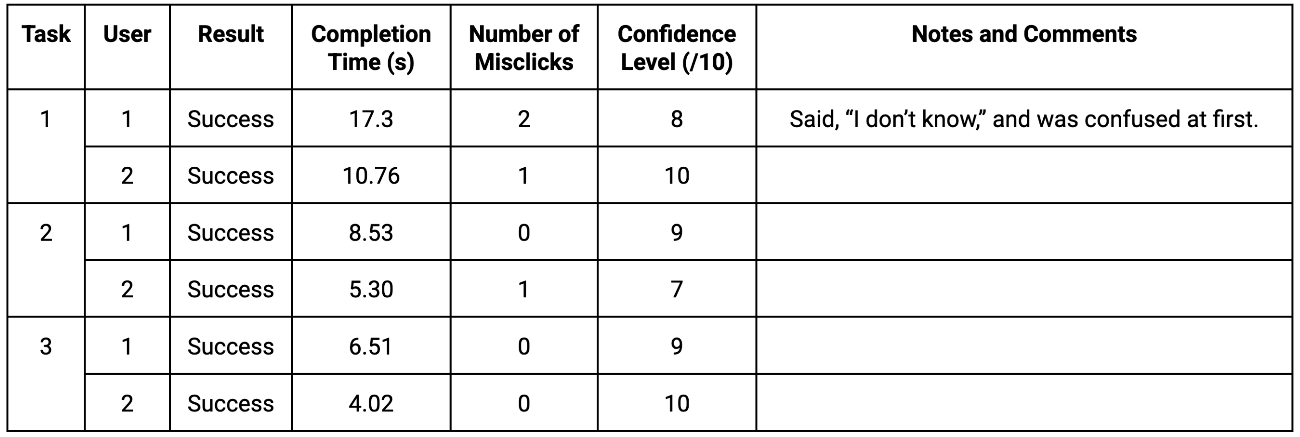
Task 1: [starting from the landing page] Share a tune that you recorded with your grandma.
Task 2: [starting from the first Learn screen] Start playing the learn lesson with clef-style music notes and no note assistance.
Task 3: [from the landing page] Find out what the “Mixed Beat” rhythm looks like.
I also prepared follow-up questions to ask user testers after they complete the three tasks. They are as follows:
1. Have you used a similar product before?
2. Were the tasks easy to navigate?
3. Were there any major bumps that you felt, and what were they?
4. Is there anything that you expected to see but didn’t?
5. Does the song catalog make sense for your age group? If not, what makes sense, classical songs or pop songs?
6. If you’ve received piano lessons before, do you think that this method could be a cheaper alternative to learning?
My first usability tester was a 10-year-old girl. Before testing, I introduced her to the purpose of Ribbit Tunes and explained the interface's goal. I allowed her to ask clarifying questions if she had any. The usability testing was in person in a 1-on-1 environment. I screen-recorded the tasks to ensure the timing was correct, and the time it took to complete each task was also noted as it occurred.
The second usability tester was a teenage girl, under the same testing conditions. The younger usability testers may not be able to give advanced feedback with specific changes to make, which is why this tester was included.
To summarize the results of the user testing and the post-test interview, the tasks and navigation are overall clear but could be slightly improved. Certain methods for improving the navigation were not provided, except for the aforementioned home page button. The user tester in the intended age group said that she understands why the songs in the catalog were chosen (they are simple and familiar to learn), but the teenage-aged user tester stated that they may be too childish. A change I would implement is having a longer list with more options. Both users think that the app alone is not sufficient to teach piano, as there needs to be more personalization and specific advice, such as on posture. One way I can think of fixing this is by incorporating video lessons into the app.
Redesigning Based on User Testing
The first step I took in redesigning was making the home logo clearer. I used a familiar house-looking icon to demonstrate that clicking that button will help the user return to the home page.
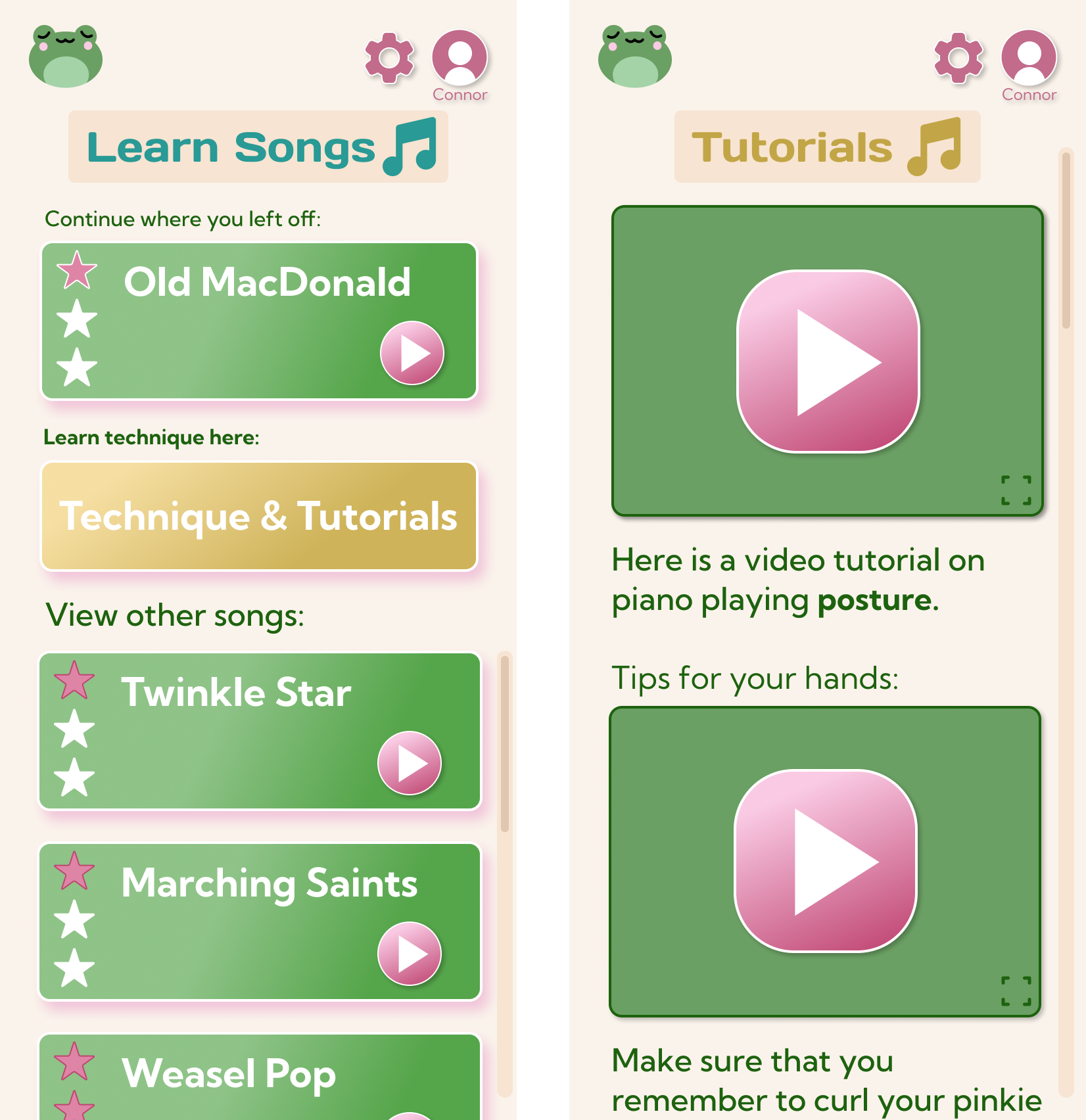
The second redesign I wanted to include was a tutorial section where users can watch someone using the product to learn proper techniques. I figured that this would have to be on the learn page.
Conclusion
This product can be beneficial to children who want to learn how to play piano or basic drum rhythms but may not have access to or the finances for lessons, which are expensive.
It can also be beneficial for children who are easily overwhelmed by lights and sounds, which a lot of children’s toys include. Ribbit Tunes is designed to be a simple and intuitive physical product with an easy-to-understand user interface. While it may not have the personalized effect that lessons provide, families are able to save money by being able to learn basic skills, songs, and rhythms using one product that is more affordable than weekly music lessons. With lessons, there is often a need for driving out, which means that money will go into gas as well. Ribbit Tunes is constantly accessible for children, families, and anyone who wants to learn from the comfort of their own home.
Key Learnings
I learned how to design a 0 to 1 educational children's app from ideation to user testing. Through this project, I was able to practice graphic design elements and implement simple, fun, and intuitive designs.