Problem Statement
How might I...
...design and create an intuitive and inviting dog washing kiosk that highlights safety, ease of use, and accessibility for various users?
Project Context
This consulting task from my Computer Interface Design class shows the tasks of creating an innovative self-cleaning service for dogs. This kiosk allows users to wash their dogs without having to worry about their level of technical knowledge.
Guidelines included:
• a resolution of 1500 x 1000 pixels, which will be presented on a 14-inch diagonal display
• developing a comprehensive set of functional capabilities that prioritize user convenience and simplicity
Design Process
Ideation
I asked myself, "What are some key features and functional capabilities this kiosk would need?"
User Flow
I created a journey map for the user's directionality while using the kiosk
Wireframing
I designed wireframes based on the features and user flow developed.
Prototyping
I created high-fidelity screens that carry the users through a friendly dog-washing journey.
Ideation
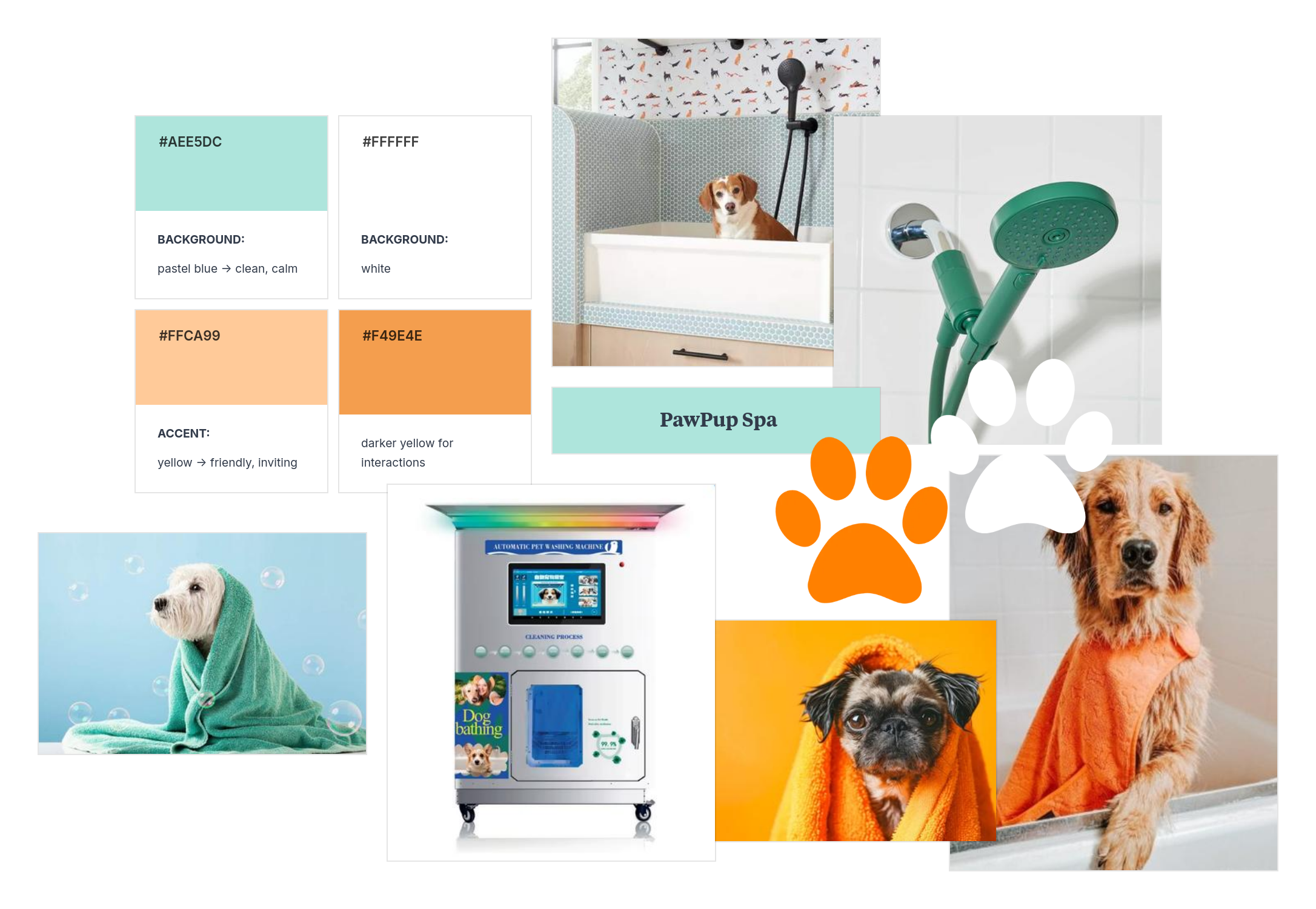
The first thing I did was create a list of functionalities that the kiosk would feature. I quickly paired this with a mood board to get my ideas flowing.
Key Functionalities
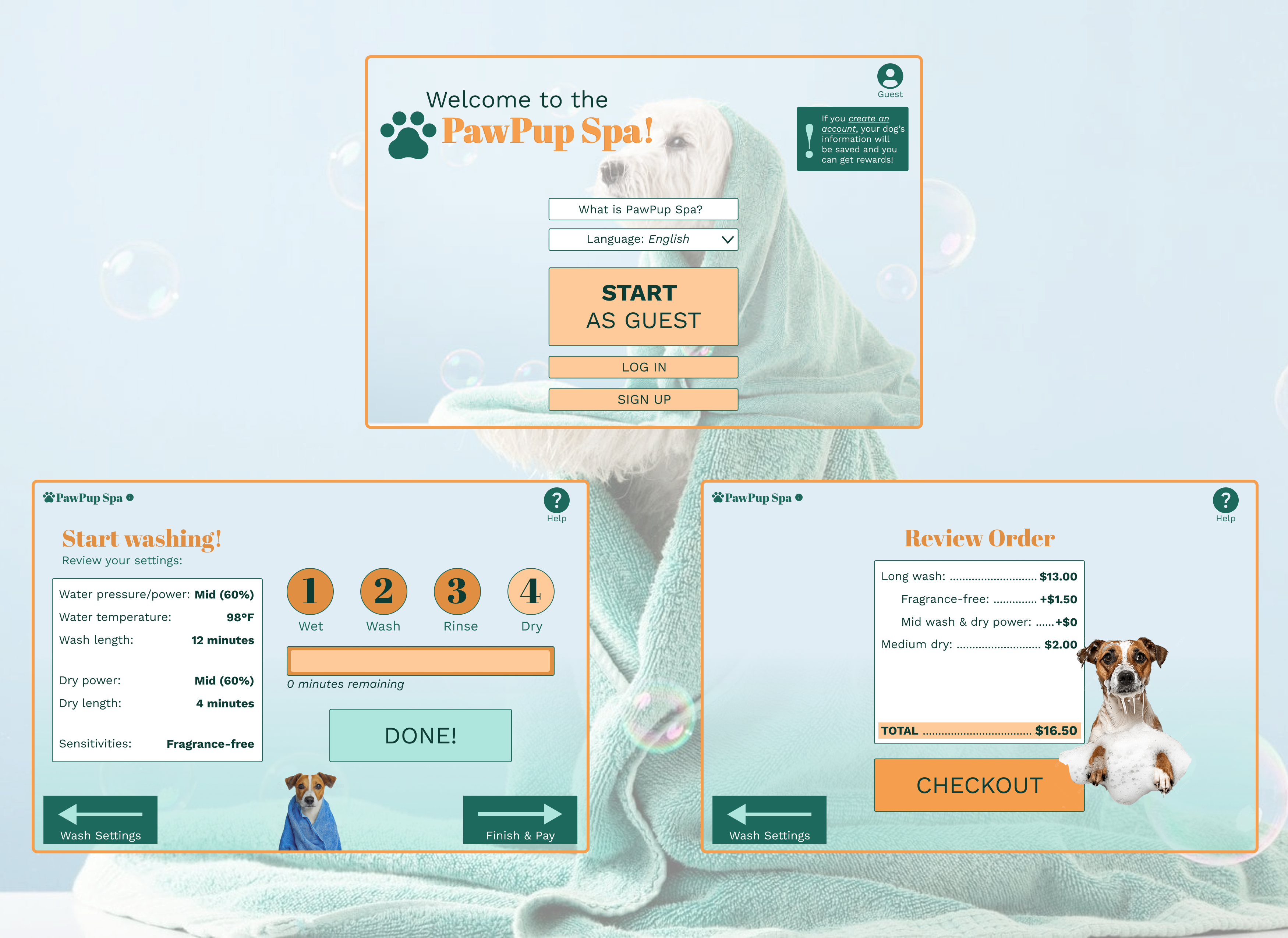
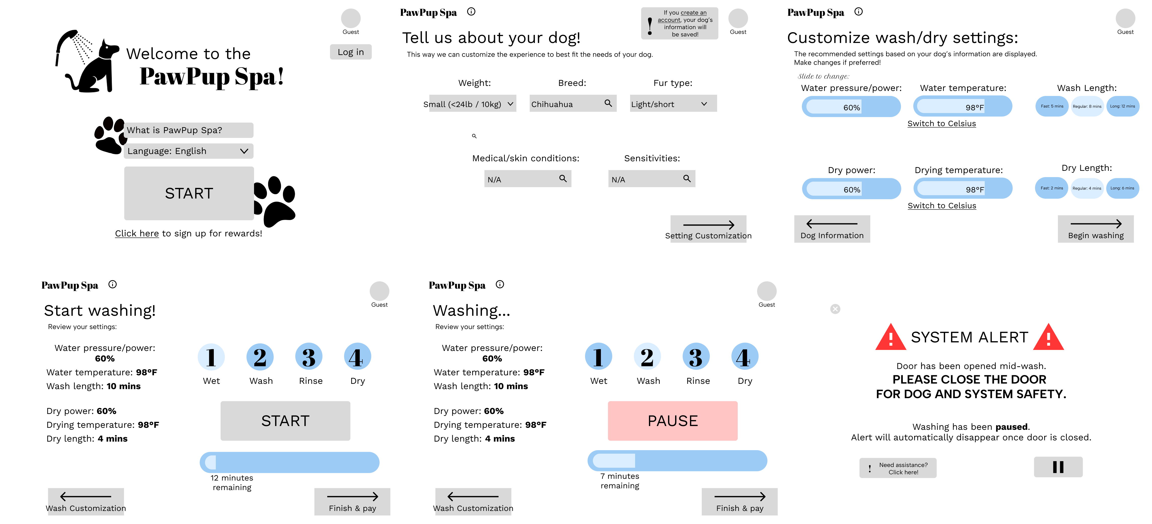
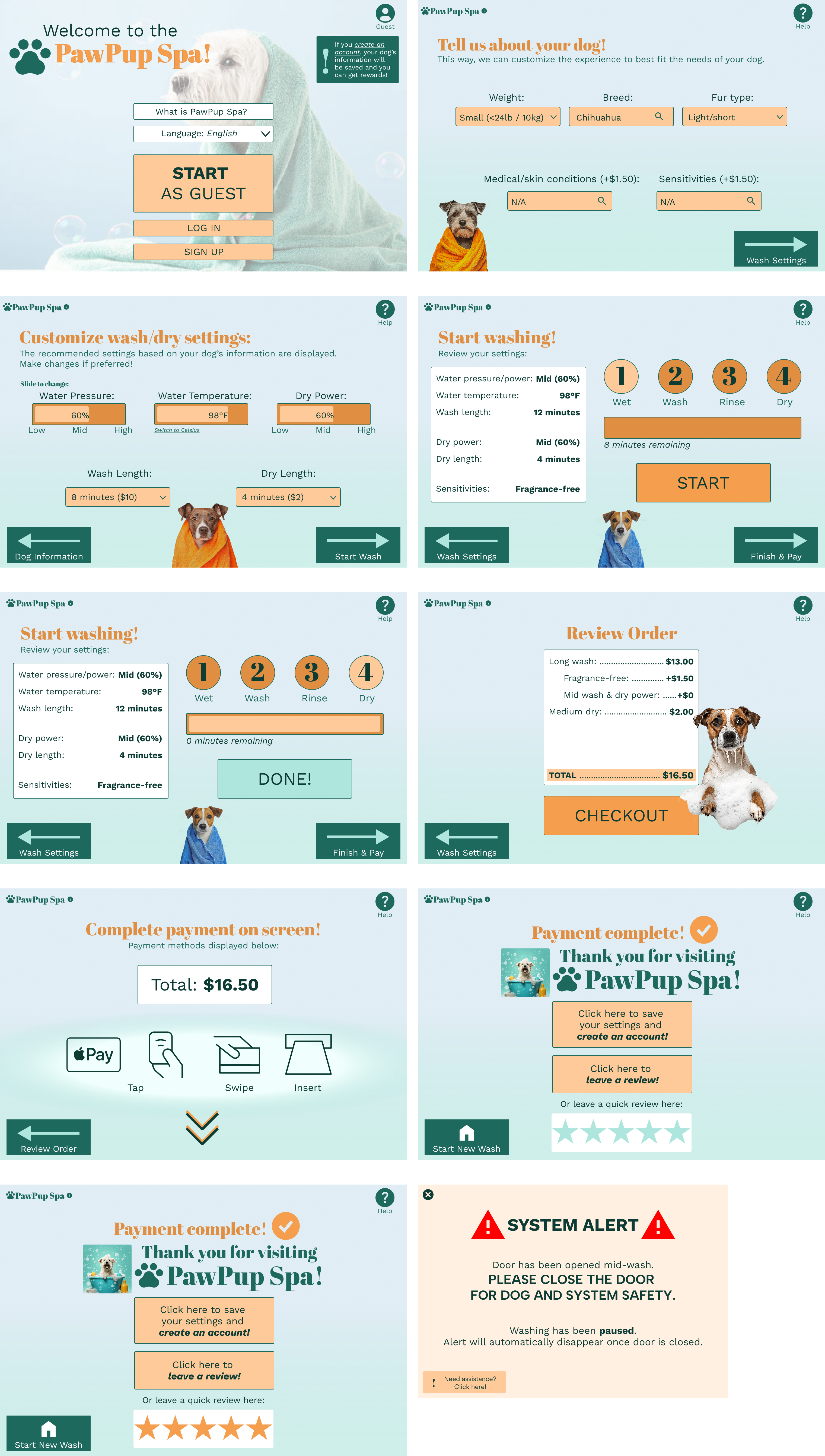
1. A welcome screen that contains a simple start to the process, an information section, and a language selection with an optional login page for members.
2. An audio player and volume bar that allows users to choose to hear the information and steps provided.
3. Recommended settings for the user’s dog based on its weight, breed, size, fur/coat type, etc.
4. Customizable settings such as power/water pressure, temperature, speed, amount of wash liquid, etc.
5. An intuitive guided process for each step that includes video tutorials and/or images, and specific Q&A for that step. The Q&A for the entire process (rather than step-specific) can also be found through an “i” (information) button on the main screen at all times.
6. Help pages where users can call the company, receive assistance from the interface for troubleshooting, and guides to solve common issues the kiosk faces.
7. Easy payment screens that can accept multiple types and provide options for memberships/loyalty programs.
8. Safety reminders, such as recommendations for how to place the user’s dog and prepare their sensitive areas. A visible button for pausing/stopping will be prominently displayed during the washing process.
9. Customizable settings during dog drying, such as air speed, temperature, time undergoing drying, and a timer.
10. An ending summary and feedback screen that informs users of the total time, the total cost, and the total work during the wash (the level of cleaning). Users will also be able to rate the service out of 5 stars or answer a short survey. (This process can help with the loyalty program.)
User Flow
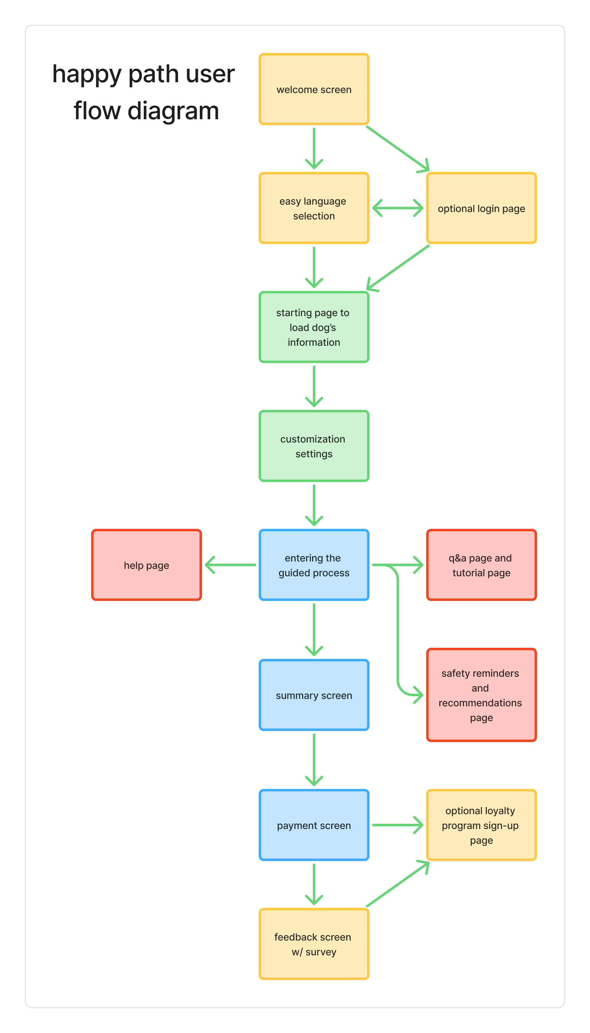
There were two things I was sure of as I planned the user flow: I wanted the path to be simple, and I wanted the kiosk process to be familiar. Inspired by kiosks that can be found at cafes or boba shops to order drinks, I was able to map out the user journey.
Wireframing
My first steps in designing was to create low-fidelity wireframes that could transform my ideas into screens. I wanted to keep the buttons familiar, similar, and the navigation clear and smooth.
During this step, I was also able to create a moodboard that could help me decide on which direction I wanted to take my designs.
I value feedback - a LOT. My professor, roleplaying as my consultant, was able to provide valudable feedback on my lo-fi wireframes. She made it clear that there were 2 main things I needed to fix:
1. Make the text more easily readable
2. Make the elements more visible; make the designs truly pop
As I began incorporating the design inspiration from my moodboard, I made sure to incorporate the feedback I received. To make the interface accessible and friendly to all users, I created a multi-language selection option. When I was creating it, I realized that I needed the buttons to be bigger so that the text was able to be read more clearly by users of different visual capabilities.
Prototyping
Of course, my final step was to create a prototype of the hi-fi frames. Check it out here!
Key Learnings
I learned how to make an intuitive design for a touchscreen kiosk that is simple yet inviting.